Pastel colours are often associated with calm, peace or a sense of ease. Colour theory tells us that the soft hues are defined by two main factors: high luminosity and a low level of saturation. In popular culture, film stills from Wes Anderson’s Grand Budapest Hotel (2014), for example, might spring to mind, or the much-photographed La Muralla Roja in Spain. In 2015, so-called “Millennial Pink” was on the rise, with Rose Quartz becoming Pantone’s next colour of the year. Now, Dulux forecasts a comeback: in 2023, soft blue and lilac are predicted to trend alongside emerald green, warm yellow and playful pink and purple.

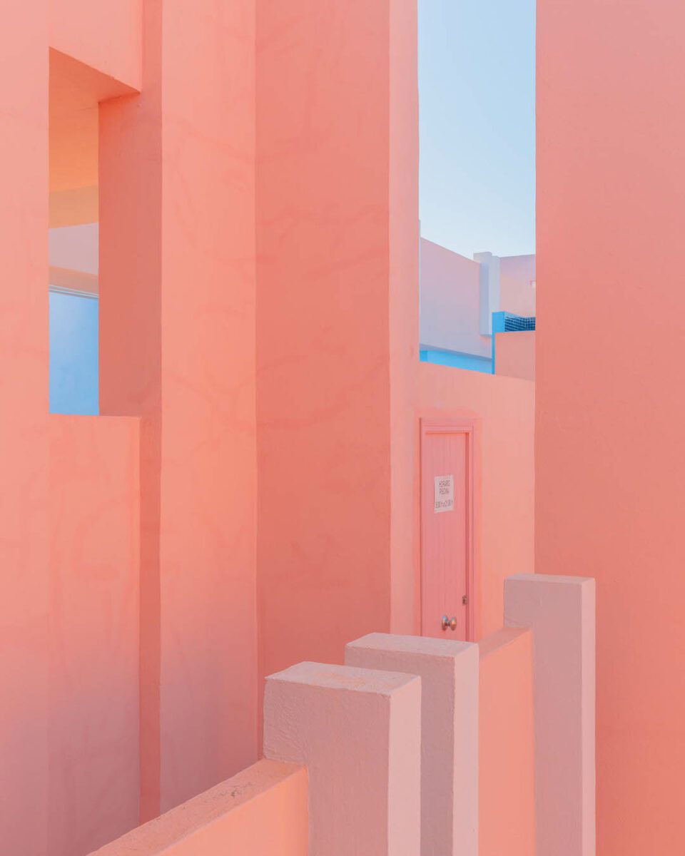

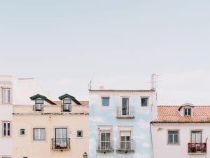
Teresa Freitas (b.1990) is a Portuguese photographer whose soft yet vibrant images experiment with the psychology of pastels. “My work lies in how colour can play with our perception of place,” Freitas writes in the foreword to her new book, published by Setanta. “The basic act of responding to colour – and its natural spontaneity – is what compels me to photograph.” Freitas’ signature aesthetic is built not only around pleasing palettes, but also visual contrasts and paradoxes. Sun-drenched buildings and verdant green bushes, for example, are pierced by sharp blood reds – traditionally seen as a symbol of danger. These colour relationships are arranged during both pre- and post-production stages; the result turns everyday places into something unfamiliar and otherworldly, as if seen through tinted glasses.


setantabooks.com | teresacfreitas.com
All images courtesy Teresa Freitas and Setanta Books.

