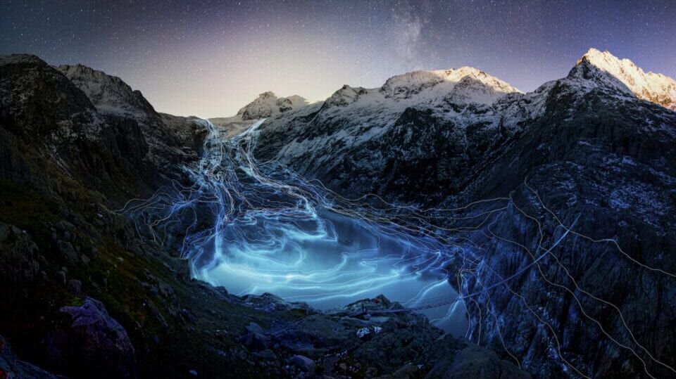
Heartbeat of the Earth
Google arts & culture lab, in collaboration with the united nations, commissions online artworks that respond to and interpret climate data.
“Human activities are estimated to have caused approximately 1.0°C of warming above pre-industrial levels, with a range of 0.8°C to 1.2°C. Global warming is likely to reach 1.5°C between 2030 and 2052 if it continues to increase at the current rate.” The Intergovernmental Panel on Climate Change (IPCC) released this vital information in a report released in 2018. Detailing predicted changes such as increases in floods, droughts, ocean acidification, food shortages and extinctions, it makes for sobering reading.
No one will escape the consequences of the climate crisis, and the report makes that abundantly clear, though the countries with the smallest economies – who have contribut- ed least to the problem – will undeservedly bear the brunt of extreme weather conditions. More daunting still is the notion that the effects will be worse if the Earth heats up even more. If the increase in temperature reaches 2°C, all species are set up for a terrifying future. Just over a year ago, the UN published another report finding that around one million animal and plant species are now threatened by extinction. The aver- age abundance of native species in most major land-based habitats has fallen by at least 20%, mostly since 1900.
The IPCC document, though illuminating, is not by any means an easy read – couched in careful terms and aimed at policy makers. Despite the fact that climate change will affect everyone, and is also everyone’s responsibility, the report is not aimed at the individual. That’s where initiatives such as Google Arts & Culture Lab’s Heartbeat of the Earth series comes into play. Freely available online, the initiative features four artworks primarily focused on user-interaction.
Kicking off the Heartbeat of the Earth programme is Fabian Oefner’s (b. 1984) immersive work, Timelines. The Swiss artist has mapped out the ever-shrinking dimensions of two glaciers, taking data from the last 140 years. Then there’s Coastline Paradox by Finnish duo Timo Aho (b. 1980) and Pekka Niittyvirta (b.1974), which uses Google Street View to demonstrate projected sea levels over the next 280 years. Meanwhile, Diving into an Acidifying Ocean by Cristina Tarquini (b. 1990) allows users to scroll through underwater visualisations from a richly diverse past to an empty future. Finally, there’s What We Eat by Laurie Frick (b. 1955), which highlights the impact of the consumer, mapping CO2 foot- prints for diets in the USA, UK and France.
Google has been showcasing projects in its Experiments Lab since 2009 and has hosted more than 1550 to date. Divided into categories such as Arts and Culture, AR, AI and Digital Well Being, these projects push the boundaries of art, technology, design and culture in order to “inspire, teach and delight.” So far, a number of large and established institutions have been involved, such as MIT Media Lab and Serpentine Galleries as well as individual artists, designers and coders. It’s an impressive initiative that came into its own during lockdown as museums and galleries around the world closed. However, it’s an interesting approach to take at any time – moving art and culture out of the traditional gallery walls and placing it directly into people’s hands and homes (provided they have internet access).
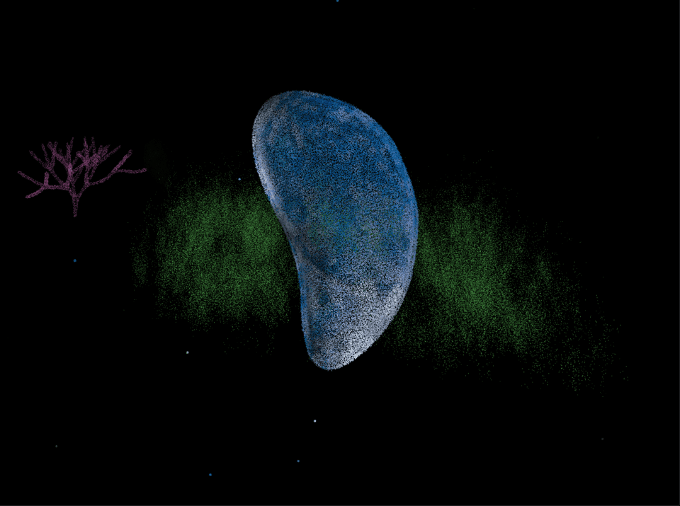
This is the crux of the Heartbeat project because, as Cristina Tarquini – one of the five key artists – points out, it’s an issue that people need to engage with urgently. Her hope is that, by looking at these projects within the safety and comfort of their own homes, people “will find the time to explore without rushing through.” For Tarquini, art should make an impact; it’s one of the main reasons she focuses on participatory projects. This latest piece, Diving into an Acidifying Ocean, is an interactive website. Upon visiting, the user can choose a particular time frame, scanning the ocean over the years and seeing how it’s changing with the click of a mouse. The page is dark, visceral and all-encompassing, but individual plants, animals and objects cut through the black – bursting into view as neon blobs which then, rather heartbreakingly, disintegrate. Along the way, viewers can find out more about each of the species and their position as the ocean acidifies. Pop-up facts can then be easily shared via social media, allowing viewers to propagate their learning further. “Interactivity really brings people into the midst of the story and helps them better understand and relate to the different problems. I also think it makes the experience more fun and appealing to try.”
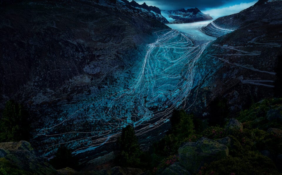
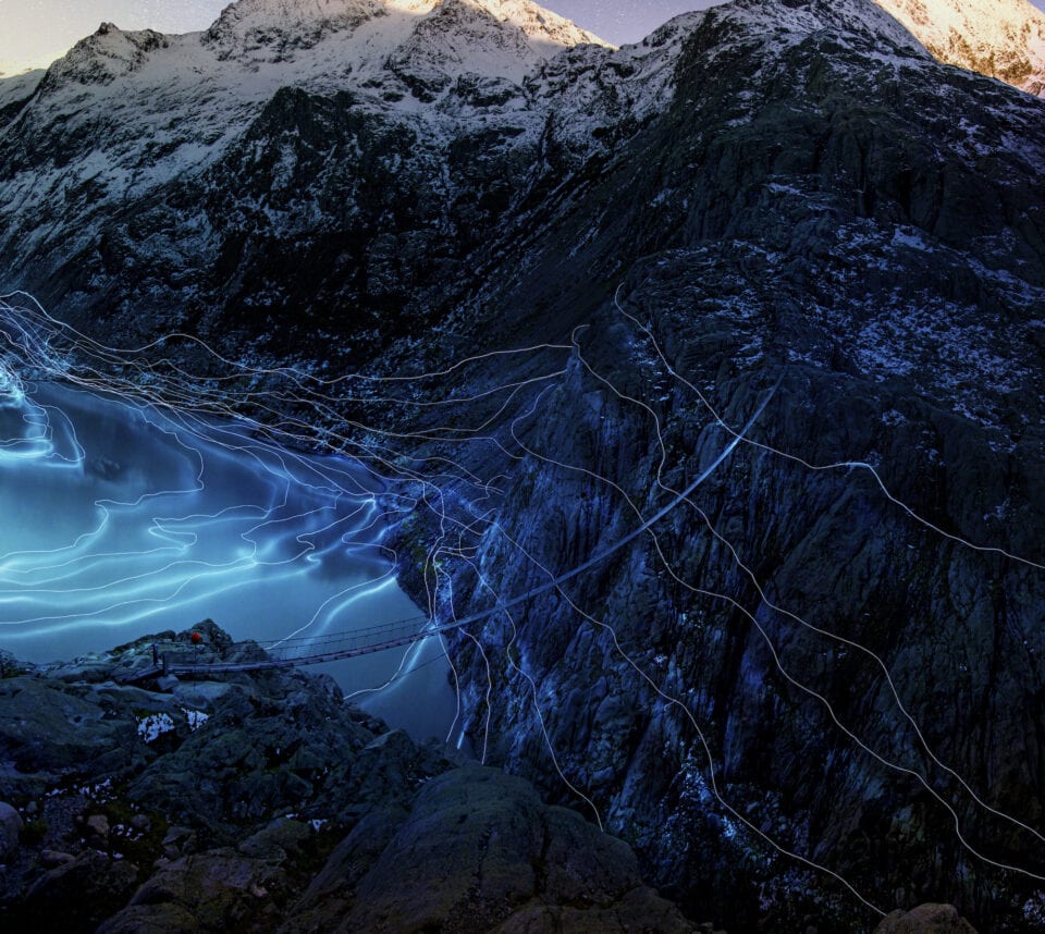
Timelines is also an interactive website – and also unfolds chronologically – allowing users to choose a year and see how large a glacier was at that point, before scrolling through the years to see how it changes shape, reducing in size. Oefner has devised “maps” for two glaciers – one at Rhône and another at Trift – both of which clearly show the same thing: the ice is receding shockingly fast. Whilst the information is bleak, the images are anything but – with the edges of the ice mapped out by light trails and recorded onto large images of the landscape. These pictures and gifs can also be easily shared, via social media or email.
Oefner specialises in creating work at the intersection of science and art, and his previous projects include a series of objects sliced into sections, as well as visuals made with chemicals and electricity. When working with the climate, he felt compelled to produce something with which he could personally connect – deliberately selecting land- forms from his home country. This sense of empathy goes beyond hard science. He notes: “If you’re producing a piece about the planet it’s important to have that connection so that you’re not just looking at numbers. I used to go hiking on the glaciers and I saw how much they had diminished.”
Tarquini, on the other hand, considered the acidification of the ocean because it’s not the most obvious topic, nor one represented often in the media. “Pollution, over fishing and rising temperatures are absolutely crucial, but if the chemistry of the oceans changes then all lives collapse. We have historical proof that a change like this caused great mass extinctions: this is something with which we cannot turn a blind eye. We depend on the oceans.”
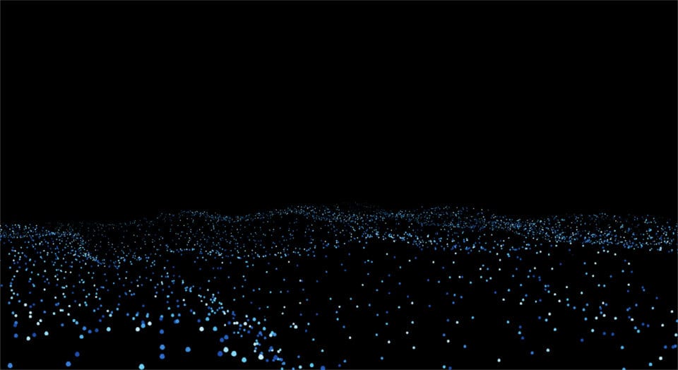
Whether personal or not, both of these projects look at large-scale ecological issues. Meanwhile, the other two pieces in the Heartbeat series – The Coastline Paradox by Finnish duo Timo Aho and Pekka Niittyvirta and What We Eat, by American artist Laurie Frick – focus on the micro scale. The Coastline Paradox is a website that allows audiences to search for particular locations and witness how those places will be affected by rising sea levels. Comparatively, What We Eat asks visitors to generate a personalised menu and see its direct C02 emissions. It’s human nature that most users will look up their own homes and diets, which means that individuals will only become more attune to their actions and perhaps make slight, but considered, alterations to their diets, consumption habits and lifestyles. All of the Heartbeat projects put emphasis on the data, but Tarquini and Oefner, in particular, have also created visually appealing work. Dark palettes are punctuated with neon flashes of colour. Bright dots coalesce as plants, animals or waste. Rippling blue lines trace the undulations of rock and ice. For both practitioners, making projects with strong aesthetics is just another strategy to help draw in viewers. Oefner notes: “The climate is such a complex topic; I didn’t want to project the sole idea that everything is gone and the whole planet is going down. Lots of projects include photographs of glaciers side-by-side – one from the 1900s where it’s completely visible, then one where it has disappeared. After a while, that gets to be very depressing. I thought it was important to keep the beauty of the planet as well as the issue.” For him, presence is more effective than absence – allowing for inspiration and hope.
The graphics are, in indeed, stunning. However, they weren’t just randomly selected for their appeal; both artists selected approaches that were intimately tied to the issue. Tarquini chose to show renderings of plants and animals that cohere together then fly apart for good reason. She was inspired by a study of the Pteropod – a small sea creature whose shell will dissolve in the pH conditions expected in 2100. “With code, we replicated the same dissolution of the study and brought it into the experience.” Oefner, meanwhile, reproduced the glacier’s contours through a drone stocked with lights. He flew across the mountain at night, mapping the co-ordinates and photographing with a long exposure. Behind-the-scenes images of the painstaking work – both in flying the drone but also piecing together the information – are equally as compelling.
In addition to rendering the ripples of the landscape, Oefner also emphasised the importance of putting the information first. It was vital to make sure that the pictures were accurate – working with the Laboratory of Hydrolics, Hydrology and Glaciology at ETH Zurich, as well as getting the project validated by Dr Andreas Bauder. Similarly, Tarquini worked with the National Oceanic and Atmospheric Administration and World Meterorological Organisation, and had her work validated by Frédéric Gazeau from the Laboratoire d’Oceanographie de Villefranche.
Oefner says: “What makes the project more than just an image is inserting clear-cut scientific value. That was very important. To me, art and science are not so different, be- cause both try to look at the world and comprehend it. But often people can’t make a connection, they just see numbers and data. I hope that, as an artist, I can explain what the data means and help them connect with it.” Tarquini agrees: “For non-scientists, sometimes it’s hard to really grasp the facts about the environment and really under- stand its cause–effect implications,” she adds. “The role of the artist is to bring audiences closer to understanding and empathising with important aspects of society. Interpreting issues is what creators can do to facilitate this process.”
Given that 71% of adults agree that, in the long term, the climate crisis is as serious as the Covid-19 pandemic (Ipsos, May 2020), we’re at a crucial crossroads. Every vote, action and lifestyle change matters if we’re to tackle the climate crisis. To achieve this, people must not only understand the data, but connect with it and, ultimately, take action.
Words
Diane Smyth
Heartbeat of the Earth was created in collaboration with Google Arts & Culture Lab and the UNFCCC
artsandculture.google.com
studiocrtq.com
fabianoefner.com
Image Credits
Lead Image: Timelines – Trift Glacier (2019). © Fabian Oefner.
1: Timelines – Trift Glacier (2019). © Fabian Oefner.
2: Timelines – Rhone Glacier (2019). © Fabian Oefner.
3: Cristina Tarquini, in collaboration with Google Arts & Culture, developed by New Chromantics. Oceans give us every second breath we take but we are changing their chemical composition and endangering all marine life.
4: Cristina Tarquini, in collaboration with Google Arts & Culture, developed by New Chromantics. Mussels: elongated bivalve suffering the effects of ocean acidification.


