Data visualisation brings information to life – making complex strings of numbers, for example, easier to digest. We might think of these representations in terms of graphs, pie charts or reports. Shots from The Matrix might even spring to mind: lines of green code cascading in front of stark black backdrops. Here are five artists – all Aesthetica Art Prize finalists – who have found inventive ways of turning information into something more: installations, photographs and sculptures. These works allow us to see statistics more clearly – from air pollution data to reports of historic government surveillance.
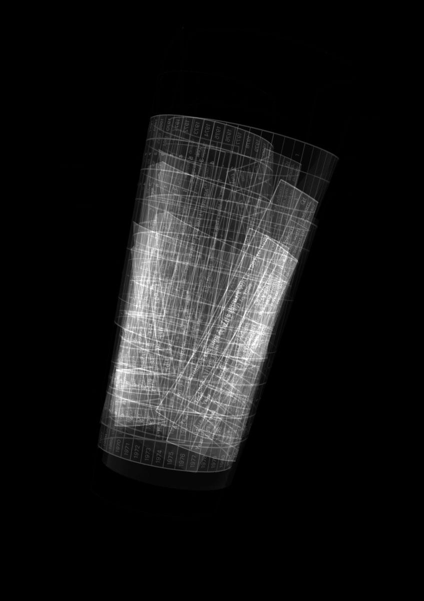
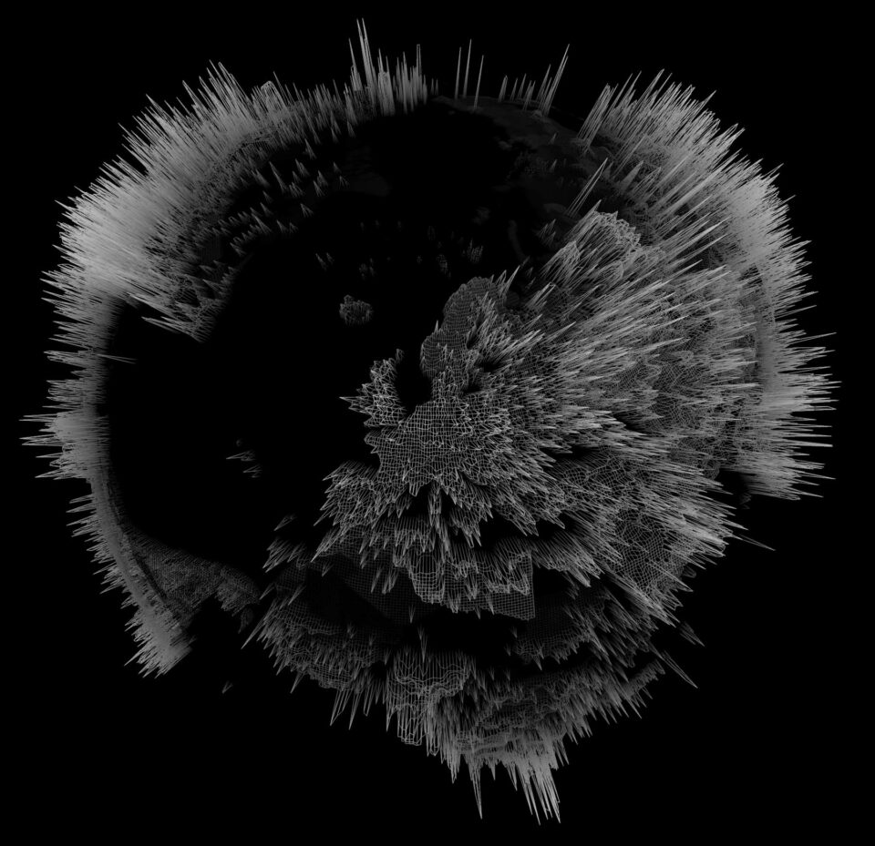
External view of the observable universe | Mark Eaglen
Mark Eaglen’s work responds to science, technology and nature – making use of a varied range of processes in order to make concepts visible. Here, he visualises data which has been collected by the European Space Agency. The resulting work represents the oldest remnants of light from the origins of the universe: the Cosmic Microwave Background (CMB). This is leftover radiation from 400,000 years after the Big Bang – it’s invisible to the naked eye because it is so cold, just 2.725 degrees above absolute zero.
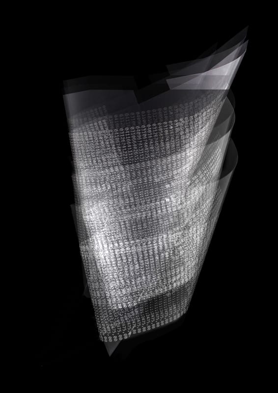
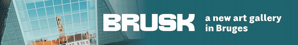
Beyond Orwell | Christiane Zschommler
In the early 1980s, Christiane Zschommler’s grandmother smuggled 1984, which was forbidden in the GDR, through Check Point Charlie. The Beyond Orwell Series (2018) focuses on Zschommler’s experiences under totalitarianism, drawing on the artist’s own Stasi file 1214/87 and found government statistics. “The reality in East Germany mirrored the worst of the paranoid excesses set out in Orwell’s book.” This retrieved data has been transformed into more abstract formations – making it visible.
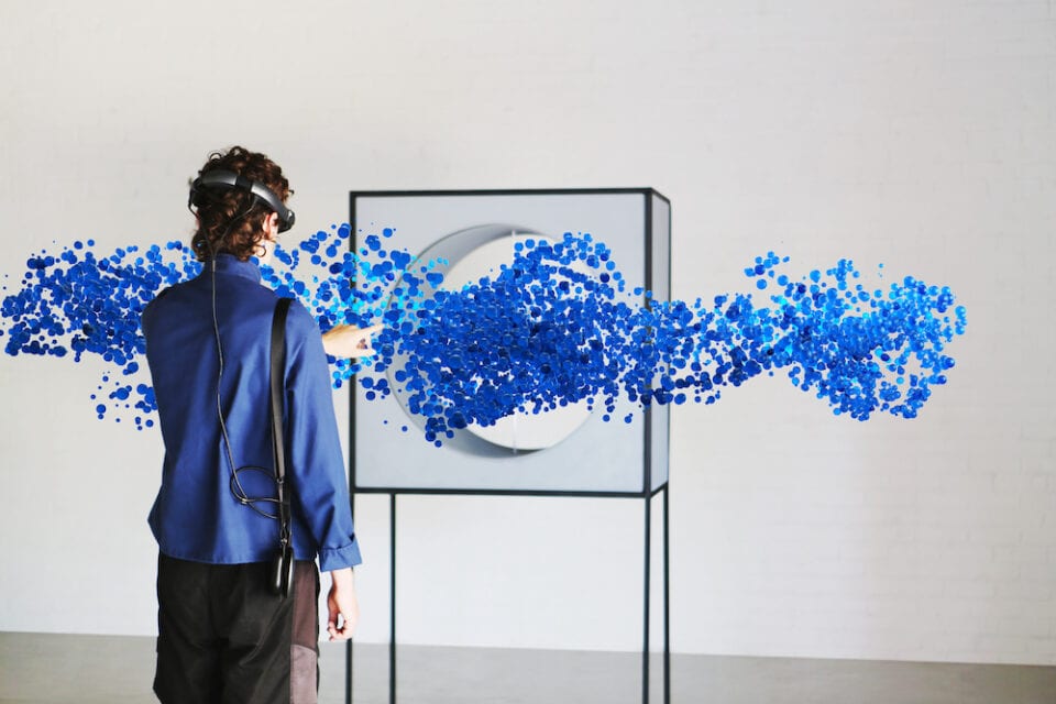
Digital Atmosphere | Studio Above&Below
“Even if the air looks clear, it is certain that you will inhale tens of millions of solid and liquid particles, travelling from one side of the planet to the other.” Digital Atmosphere is a Mixed Reality sculpture combining air pollution data and Augmented Reality to “give the environment a voice.” The innovative piece allows the public to experience fine changes in air quality, which are invisible to the eye, but not to our lungs. Studio Above&Below’s work combines digital art and computation in order to draw together unseen connections between humans, machines and the environment.
Carbon Chronicles | Manifest Data Lab
Art has long found ways to make tangible the planet’s atmosphere, and its changing chemistry. Manifest Data Lab’s Carbon Chronicles visualises the build-up of CO2 from the industrial revolution to the present. Beginning with the UK in the 1750s, emissions from coal start enveloping the planet. By the late 1800s industrial activity in the Global North is responsible for 92% of CO2. The animation informs the need for equitable solutions to the climate crisis, and, ultimately, asks: who owns the air?
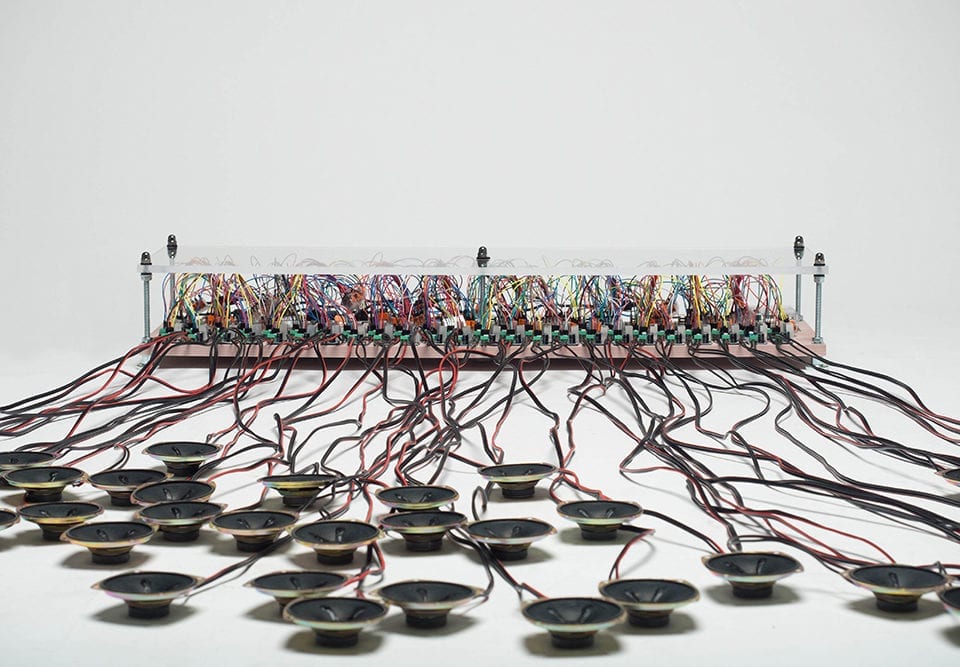
“The relationship between humans and the internet can be practically described as ‘The limits of my language mean the limits of my world.‘”, writes Suzuki. Oh My ( ) is an installation that calls out “god” in 48 languages using a Twitter database. The machine monitors the Twitter timeline in real time and, when a tweeted text includes the word god, speakers sound “oh my (god)” (in the appropriate language) at the same time. The list of languages includes Arabic, Croatian, Hindi, Latvian, Persian, Spanish and Urdu.

