
Werner Bischof (1916–1954) was a pioneer of photojournalism. The Swiss artist achieved international recognition following the release of his photographs showing the devastating aftermath of World War II. In 1949, he was the first photographer to join Magnum along with its founding members. His name stands for humanitarian commitment and moral integrity, but also a tireless search for beauty and compositional perfection. Although he is widely known for black and white images, Bischof experimented with and produced impressive colour pieces. For instance, his travels across the USA in the early 1950s resulted in an expansive series filled with scarlet coca cola posters, sunsets behind Chicago skyscrapers and highway construction workers poised on orange beams far above. In one shot, we see the zig-zagging pattern of parked cars on top of a bus terminal. These large-scale views call to mind the work of Andreas Gursky whilst the collection as a whole speaks to Joel Sternfeld’s American Prospects published decades later.
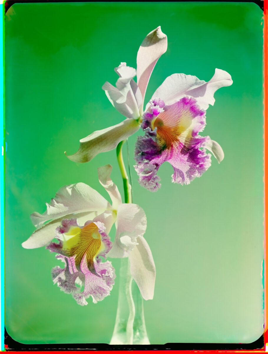
Fotostiftung Schweiz’s latest exhibition, Werner Bischof: Unseen Colour, focuses on Bischof’s lesser-known polychromatic work. From 1939 onwards, he took several hundred glass negatives with the Devin Tri-Color camera. With it, users could expose three light-sensitive glass plates at once and it’s colour filters enabled images to be separated into blue, green and red. These were then overlayed on paper to form one full-colour print. The results were luminous and richly hued, making it the staple tool of trailblazing colourist Madame Yevonde. We see Biscoff’s skilful application in works like Orchid Study (1943), which shows paper-white petals contrasted against a green background. The flower’s vivid centre bursts with shades of orange, magenta and yellow. Photography of this kind was more than something he was tinkering with on the side. It was a significant, and still underestimated, part of his artistic practice.

At the time, images of this nature were mostly seen in the realm of advertising and fashion. They were not taken seriously in fine art and photojournalism, especially since press publications printed in monochrome. Bischof was amongst those who embraced the possibilities of this approach. In a 1952 letter to his friend Robert Capa, he stated: “At heart, I always remain a painter, who sees in colour, beyond the things themselves, who is always enthused by the fullness and richness of human means of expression, and who is always a little melancholy about the limitations of the camera.” Unseen Colour not only treats viewers to rarely-seen pieces but brings into focus one of the most important facets of Bischof’s practice.
Fotostiftung Schweiz, Werner Bischof: Unseen Colour | Until 28 January
Words: Diana Bestwish Tetteh
Image Credits:
- Werner Bischof, Orchid Study, Zurich, (1943) © Werner Bischof Estate / Magnum Photos.
- Werner Bischof, Women in ruins, Berlin, (1946) © Werner Bischof Estate / Magnum Photos.
- Werner Bischof, Grain drying, Castel di Sangro, Italy, (1946) © Werner Bischof Estate / Magnum Photos.

