
Occupying the top floor of the Ikon gallery is a retrospective collection of the graphic designs pioneered by Tony Arefin. Despite Arefin’s name remaining largely unknown to the general public his work is widely considered a staple mark of 90’s fine art graphic design. Arefin is celebrated as a transgressor of the graphic design world, able to create works that bore an incredible air of visual communication between the viewer and the work. This ability quickly lead to his breakthrough which saw Arefin designing posters and catalogues for the likes of Institute of Contemporary Art, the Serpentine Gallery, The Chisenhale Gallery and the Ikon gallery. These elite lists of clientele lead to design critic Rick Poynor describing Arefin as “single-handedly processing the print needs of the entire British art scene.”
Definitely a student at the “less is more” school of thought, Arefin’s work is liberally awash in minimalism as well as incorporating geometric reductionism and elements of constructivism. In one example of Arefin’s Chisenhale gallery catalogues there is a double page spread showing, on the left hand page, a close up black and white photograph from a series of sculptures filling the entire page. The wall seems battle scarred and the grey scale illuminates its aged face. The sculpture, a small black box with a hose like wire coiling away from it, sits in the middle of the page like a grotesquely seductive enigma. On the right hand page is a smaller image located towards the top of the page. It’s given a supreme sense of isolation, as the white of the page engulfs it, giving it a natural a-symmetrical border. The image shows the whole sculpture series which reveals 3 boxes in height order going from smallest to biggest from the right hand side. There is a metallic disc sat upright on the far left. The boxes have the same impenetrable black colouring as the close up of the sculpture on the left hand page, and are tied together by a cable twisting along the floor snaking amongst them. The power emphasised by the simplicity deployed is incredible. Arefin has given this particular sculpture an entirely new identity that could only exist in this context. The photography’s cold, gothic, monochromatic pallet entwined with the pristine white of the page that storms around it blankets the whole composition in an icy sea of lifeless animosity.
Arefin’s own design for the Ikon sits proudly in full view of one’s entrance in to the room, subtly bathing the room in its glory. It’s a simple yet iconic slave of the power in typography infused with a signature creative twist immediately recognisable as Arefin. It shows the word “IKON” in thick geometric lettering. The word “GALLERY” is in a much smaller font size next to it. The lettering is set off from the white of the wall, alienating each of the larger letters as a series of cryptic symbols. The minimalistic tendencies here painfully show just how little is needed to create something that has become so synonymous with such a sought after institution, and to do this consistently over a career with so many other institutions as well as being able to inject with a signature motif so to speak, is truly remarkable.
Opposite, on the other side of the room, looms perhaps the most iconic piece. A huge Yellow rectangle outlined in black with a small v shape cut in to the top left hand corner. In the centre are three different sized black rectangles housing the words “I CAN SEE,” “THROUGH,” and “WALLS” all in white text. The italicized “THROUGH” counter balances the rectangular patterns ridden within the work grabbing the viewer aesthetically. The colour pallet is reminiscent, in ways, of the bold tabloid and advertising influenced Pop Art of Lichtenstein. The overall composition seems vaguely similar to those that have made Barbara Kruger such an instantly recognisable force within the art world. The aggressive impact of the composition and minimalistic contrasting colour pallet that creates an arousing sense of demanded attention is seen utilized liberally throughout both their careers. The composition appears to hold a great deal of enthusiasm and excitement, with the bold pallet acting as a recipe of captivatingly satisfying iconography sucking in the viewer like a vortex.
Sadly in 2000 Arefin tragically passed away ending his on-going run of dynamic and personalised graphic designs that have literally altered the face of British design commercially. If one were to go and see an exhibition in a major British gallery the chances are that one would have been reading from a catalogue that he designed. But sadly outside the circle fortunate enough to appreciate his artistic brilliance, he remained just another face in a crowd. Now this is changing, Arefin is receiving the attention he rightly deserves. This brings back the iconic Ikon logo design which one cannot help but view as a fitting tribute. The size difference in the words, highlighting the word “Ikon”, seems now to possess an ulterior motive, as a perfect example of his own creative design addressing Arefin’s own ability and legacy as a true British icon.
The Graphic Design of Tony Arefin will run until the 4 November, Ikon Gallery, 1 Oozells Square, Brindleyplace, West Midlands B1 2HS,
Will Davie
Credits
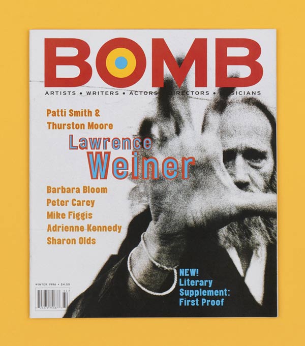
1. Bomb magazine, Winter 1996, 315 x 275mm, Designed by Tony Arefin
2. Magic Box, Newspaper insert, IBM, 1999, 550 x 340mm, Designed by Tony Arefin


