
Minimalism is timeless. It offers simplicity and stripped-back aesthetics; new buildings draw attention to design as a blank page full of possibility.
“White reflects and intensifies the perception of all the shades of the rainbow – which are constantly changing in nature,” stated Richard Meier (b. 1934) when he accepted a Pritzker Prize. He is the creator of the Getty Center, Los Angeles, and Barcelona Museum of Contemporary Art. His practice has become synonymous with a signature monochromatic palette. Bending the viewer’s perception, such constructions favour walls, windows, floors, doorways and rooms as an experience – a pathway through space and light.
Meier is, of course, not alone in his curiosity for stark simplicity. As Juan Serra Lluch states in Color for Architects (2019): “In his early texts, Le Corbusier primarily warned of the dangers of colour. The Swiss maestro refused to let ‘the wall turn into a tapestry, and the architect into an upholsterer,’ suggesting we should ‘research and select the colours that can be called eminently architectural and restrict them so that we can tell ourselves: these are enough.’”
The use of, and meaning behind, white in contemporary architecture is the subject of Philip Jodidio’s latest title, published by Thames & Hudson. Jodidio is the author of more than 25 books, including substantial monographs on Tadao Ando, Renzo Piano and Zaha Hadid. In this new publication, he culminates research around the surprising ways contemporary practitioners, like Meier, produce domestic spaces that invite contemplation, functioning as both residences and works of art. “Though these modern houses tend to appear quite simple and geometric in their plan, they are sculptural. They verge on abstraction. They represent a new archetype.”
Creatives across disciplines have long been drawn to white – be it paint, plaster, marble, concrete or stucco – for its illusionistic properties. Russian painter and theorist Wassily Kandinsky (1866-1944), who is best known for booming, vibrant canvases wrought with abstract forms and dancing pops of pigment, once stated that “colour directly influences the soul.” And weighing in on white, specifically, he said, “it is not a dead silence, but one pregnant with possibilities. It has the appeal of nothingness that is before birth.” Similarly, avant-garde artist and scholar Kazimir Malevich (1879-1935) invited his peers to embrace limitlessness when he said: “I have broken the blue boundary of limits, come out into the white; beside me comrade-pilots swim in this infinity.” The idea that absence has the power to elicit soul-stirring emotions is interwoven in Jodidio’s compendium. There are 40 examples that demonstrate this concept, segmented into five digestible strands: Sculptures for Landscapes, New Angles, Elemental Forms, Urban Oases and Waterside Reflections. The lack of colour isn’t just a design consideration, it’s inherently about stirring curiosity about what surrounds us.
It is apt to start with the idea of a blank slate. White buildings have the power to deprive inhabitants of their senses – as seen in Jin Otagiri’s appropriately named Ghost House (2005) – or heighten them, as exemplified in the seaside retreat by Kapsimalis Architects, named Summer House (2017). Presenting a spectrum of opportunity and interpretation, white, as the introduction to this book explains, causes viewers to look more closely and to feel more deeply. “If any architectural volume can be assertive and still make way for the observation of nature and the propagation of light, then white it should be.”
A paradigm of a perception-bending construction is Dwek Architecture + Partners’ magnificent, postcard-perfect Silver House (2015), which merges the disciplines of design and fine art to create a one-of-a-kind treasure on the Greek island of Zakynthos. In this instance, the building takes style cues from French artist Yves Klein (1928-1962), known for a trademark blue hue. He once commented that the shade “is beyond dimensions.” The powerful combination of the rich blue ocean with the flat white home induces the atmosphere of immersive exhibitions – not unlike the jaw-dropping mirrored surfaces of Yayoi Kusama’s blockbuster Infinity Rooms, or indeed Kimsooja’s mirror installation To Breathe, currently on display at Yorkshire Sculpture Park, Wakefield. Olivier Dwek speaks about the creation: “From the terraces, the sitting room, the dining room, kitchen, bedrooms and bathrooms, the living space is oriented towards this fascinating seascape, which the architecture emphasises, making it even more theatrical.” The use of the word “theatrical” is rather fitting in this instance, as the resulting home is as dramatic, remarkable, and, in some ways, unbelievable as a stage production. The key here was to produce an otherworldly oasis using a deliberately limited colour palette, blurring the lines between home and horizon, reality and fantasy.
Why choose something so simplistic, which evokes questions about what’s real in a world of media saturation, post-truth and overstimulation? Perhaps the answer lies within humanity’s emotional attachments to the spectrum – experiments that have long been realised by the likes of Dan Flavin, Olafur Eliasson and James Turrell. As Color for Architects’ author notes: “It is well-known that white is associated with purity and innocence in western culture, whilst in eastern countries it is associated with death.” Unlike blue – reportedly the world’s most calming of hues – red, yellow or brown, white teeters on the brink of reality in our minds – it is devoid of detail or over complication and is only with us for our most human moments: in meditation or reflection.
When did white become a trend? The latter part of the 20th century was filled with patterns, colours and embellishments – from fashion to interiors. However, moving into the 21st century, a number of key influencers recognised the demand for simplicity as a symbol of renewal – pulling at the desires for sleek functionality. It is here that successful design is split into two categories: responding to a need or providing us with an aspiration. White clothes have endured as a staple to be coveted. This ranges from DKNY’s statement underwear to Lacoste’s polo shirts. Similarly, the wardobe itself has changed – brands like IKEA publicise affordable, stripped-back Scandinavian living – offering almost all flat-pack items in a version of white (to wit: the lowest cost option.) IKEA even made an appearance at London Fashion Week in 2018, with a range of bags, tops and belts. Moving further back down the production line, Ludwig Mies van der Rohe’s simplistic stainless-steel Barcelona chair (1929) is still enjoying mass-distribution 90 years after its creation.
The discourse surrounding the evolution of design must include new technologies. Apple – now valued at $1 trillion – revolutionised the world of music with the first iPod, unveiled in 2001. Such an instrumental accessory – though now dwindling in circulation with the rise of the iPhone – marked an empire of selling all-white earbuds. As Chris Weller stated for The Business Insider in 2016: “Apple followed up the release with a huge advertising campaign highlighting the headphones. Blacked-out silhouettes danced over tropical-coloured backgrounds, all whilst listening to the tunes playing through their earbuds. More than ever, those buying into the products saw the company’s commitment to standing out and thinking differently. The company got its money’s worth with the idea, running for more than five years between 2003 and 2008 as they released new generations.”
What was the purpose of such a high-cost campaign? “Psychologists have acknowledged, since iPod’s release, the decision to make its earbuds all-white sent Apple’s cache as an uber-cool company into the stratosphere. ‘Tell-tale earbuds indicate to passers-by that the bearer ascribes to certain notions of style,’ behavioural scientist Gad Saad wrote in Evolutionary Psychology in the Business Sciences. The iPod user ‘engages willingly in some degree of conspicuous consumption.’ As Saad points out, ‘that’s a lot of information content for less than an ounce of plastic and wire.’”
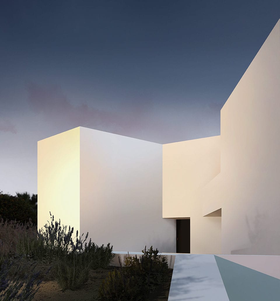
Minimalism – by way of taking away unnecessary patterns, gadgets and gizmos – can often provide room for the most complex ideas. Many examples from Jodidio’s research re-order and re-contextualise rooms and spaces for the benefit of the user in this way. Alberto Campo Baeza’s dream-like Cala House (2015) may seem simple, but the streamlined geometric shape conceals the utter labyrinth of its design. It was inspired by Austrian-Czech architect and theorist Adolf Loos’ Raumplan system, which divides the interior of a residence into a series of multi-level spaces arranged in order of importance. It is here that Apple’s intelligent and internationally distributed decisions ring true: the absence of colour provides the space to reevaluate and prioritise.
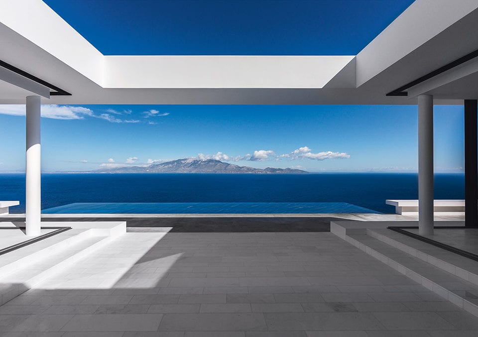
Furthermore, the Cala House has an open-roofed terrace. Like in any meditative Sky Space by James Turrell, the time of day, particular season, and amount of cloud coverage dictate the viewing experience from within – meaning no two moments are ever the same. Architecture is performative – it encourages its inhabitants to truly be present. “I think people search for light,” Jodidio states. “It is a way of making your own existence somehow simpler, allowing us to appreciate what is around us. It is an invitation to stay.”
Domesticated and civic spaces are at the crux of innovation. This is wholeheartedly true of White Cave House in Kanazawa, Japan. Built in 2013 by Takuro Yamamoto, this cosmic creation differs from other examples in that it was produced to withstand four distinct seasons – in particular, a snow-filled winter. “The project is, in part, an echo of the typical snowfalls in Kanazawa,” writes Jodidio. “The strict, often closed volumes as seen from the outside make this into a luminous space where dimensions and time can seem to dissolve.”
Upon first glance, the buildings can be interpreted as stark, clinical – even hostile. Going deeper, the structures offer clean, open expanses as a source of creativity. Much like a white cube space, the blank walls offer artworks room to breathe. It is apparent that Meier and his likeminded contemporaries favour white because, in the absence of colour, we are offered a blank page. White architecture punctuates a world of constant noise and global expansion. Referencing Kandinsky, we return to Jodidio’s opening thoughts about the appeal of nothingness: “White has this harmony of silence that works upon us in a negative way, like many pauses in music that temporarily break the melody.” Looking to the future, the minimalist trend provides something we may both want and need: it teaches us to stop, think and imagine.
Stephanie Strasnick
White Houses is available from Thames & Hudson.
www.thamesandhudson.com.
Color for Architects is available from Princeton Architectural Press.
www.papress.com.
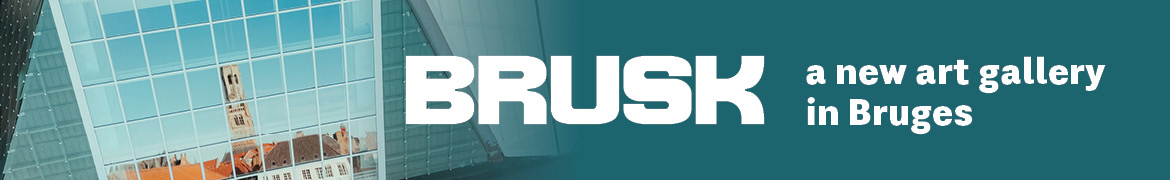
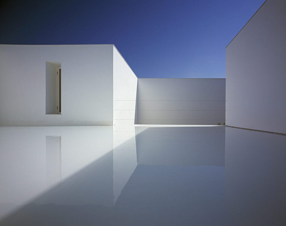
Lead image: Montenegro Architects. Sugarcubes, Grândola, Tróia, Portugal, 2014. Image Credit: © Montenegro Architects Studio, Ltd.

