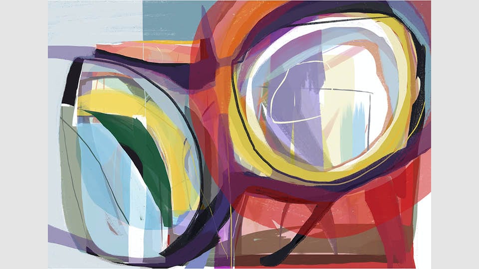
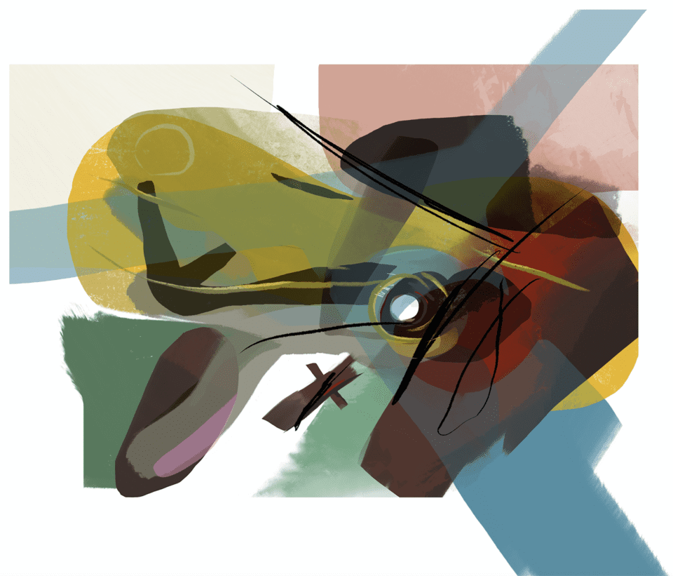
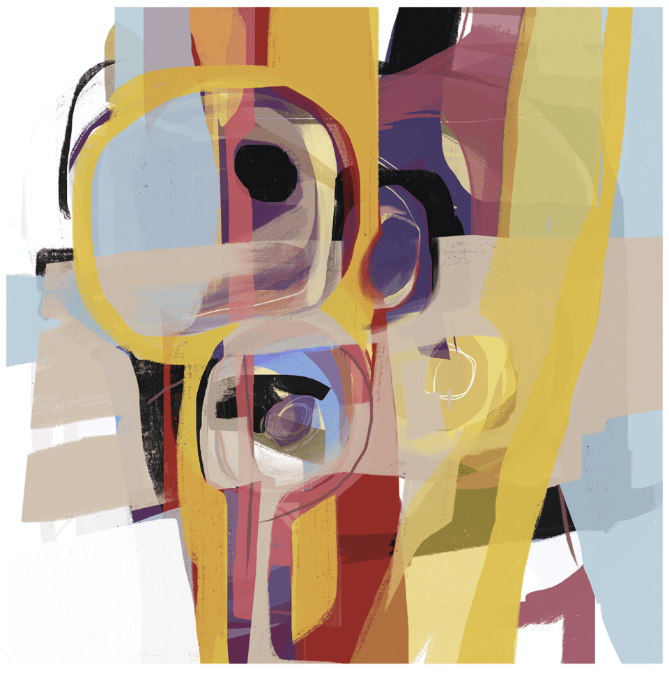
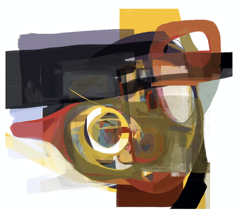
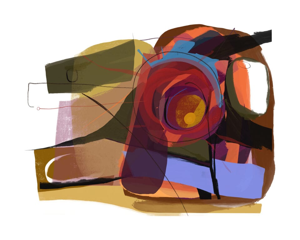
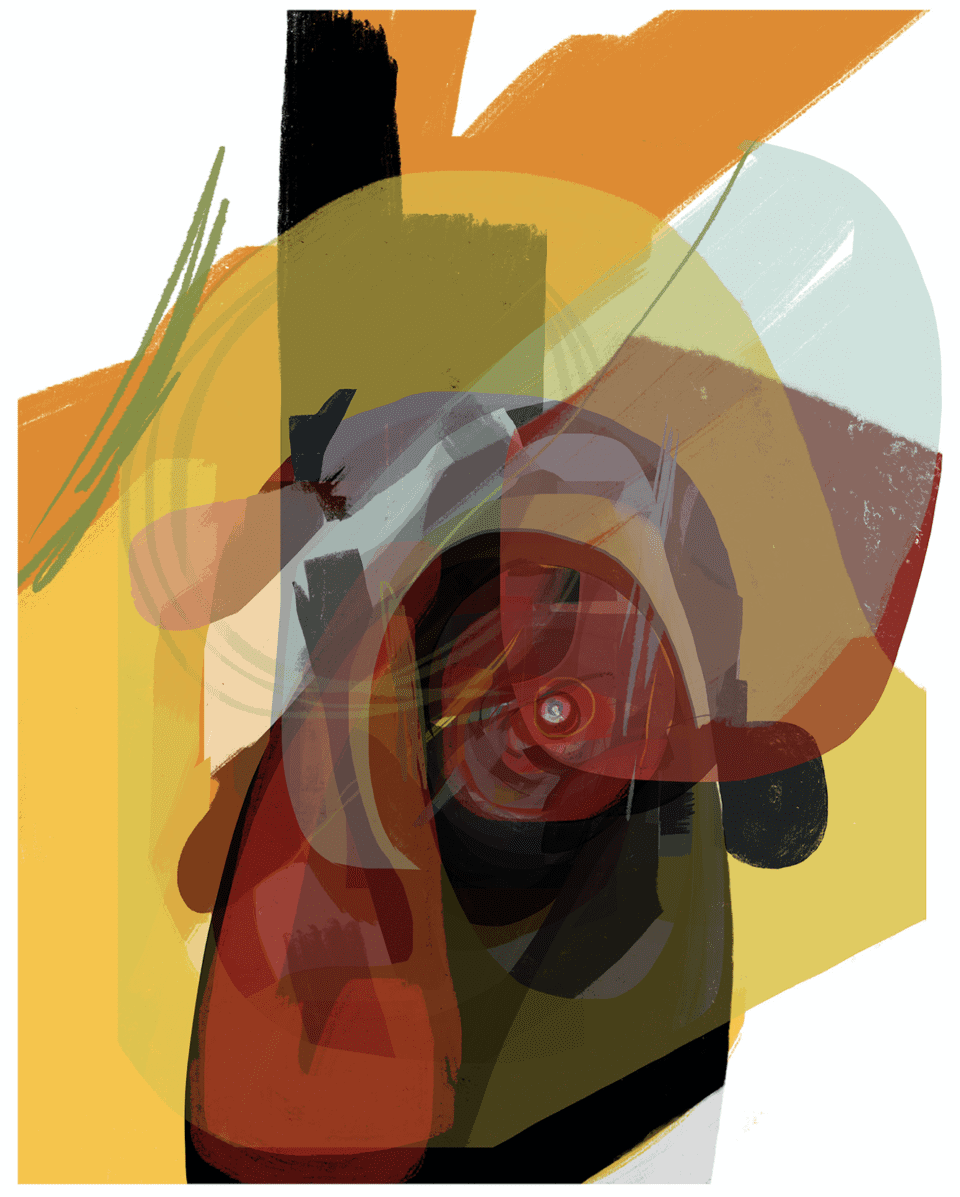
Abstract artist Paul Brown expresses a love of colour, line and layers through his varied practice. In each piece, he adjusts the space on the canvas, offering endless vibrant possibilities and interactions between shapes. The works delve into the subconscious – seeing an image through to its resolution.
A: What drew you to use abstraction after working as an illustrator for a number of years?
PB: I’d always painted outside of the illustration work, kept sketchbooks and made my own personal images but never had the confidence to consider focusing on it. About 15 years ago I had cancer treatment followed by a brain infection and that’s what really stopped me working on illustration commissions because the tight deadlines didn’t suit the new state of mind. I’m much happier working abstractly and to be honest it’s been great therapeutically in externalising issues and concerns during my recovery.
A: How has your graphic design background influenced your current work?
PB: Although my degree was in graphic design, I specialised in illustration fairly early on. I’m still aware of balancing elements visually both in terms of form and colour within the picture space. It’s not immediately evident but through the process of building an image there’s an awareness of how things sit together in a space, it’s something I try to shake off now and then but I guess it’s always there, guiding the choices I make.
A: You create digital paintings. How does your work develop the language of abstraction through new technologies?
PB: There’s so much freedom to play, make mistakes and take a few steps back or grab layers from one thing and apply them to another unrelated image so chance plays a large part. When using layers you can swap them around and alter their opacity – I suppose it allows for the unexpected and means that you’re not tied or committed to decisions you make visually. It’s another means to an end really.
A: What processes and equipment do you use to create these works?
PB: It’s an iPad Pro these days, with an Apple Pencil and and an app called Procreate®. Starting with a blank canvas I choose brushes, medium and colours and just get mark making. I can transfer an image over to Photoshop on the Mac mini with my layers preserved and add scanned in, real-world, line, ink and textures as I please.
When I’m happy that an image is finished I’ll check and adjust the colours to make sure they’re okay for printing and flatten the layers so that it can be uploaded to the printers, ready for printing.
A: How do you decide which colours, lines and shapes to layer – is it random, or is it a methodical approach?
PB: There’s certainly a random element to the mark making but I wouldn’t say that other decisions fall happily into categorisation as either random or methodical. There’s an intuitive or instinctive response that’s informed by years of practice and also by referencing my own life experience. The process is dependent upon my state of mind, mood and what I’m seeing already laid down in an image.
A: What is it about the use of shape and geometry that inspires you?
PB: Perhaps I find that there’s some comfort to be had in geometric shapes: they have a solidity and regularity that’s safe and dependable. They contrast with some of the more intuitive mark making in the work. There’s also the fact that a circular motion is a very natural movement to make physically so when making gestural movements there is a tendency to create circles and curves.
A: What is it about your specific use of colour that your collectors appreciate?
PB: I can’t really speak for the people who are drawn to my work; hopefully they see my love of colour and the way that colours can work together in inspiring a response from the viewer. It might be a feeling or a memory, but certain colour relationships can prompt responses relating directly to a person’s own life experience and with the work being abstract, there’s no specific meaning to be read – you bring your own.
A: Your works delve into the subconscious. Tell me about how you prepare yourself before starting a new piece, and what is your creative process?
PB: I can’t say that there’s anything I do to prepare myself. It’s always exciting and something of a treat to start with that blank space and not know what’s going to evolve within it. I just have an idea of the physical picture size, choose my brush and colours and dive in. There’s never a plan as such; there might be something I’ve seen or read or heard that just triggers me and I’m off. It’s helpful sometimes to have some background music but at times silence is good too.
A: When working in your studio, do you think you achieve a sense of flow?
PB: Hard to say really; it does take some nudging at times to get back into the work but once I’m there I can lose myself for hours. Everything else just moves out of focus and I’m absorbed by the process in front of me. I work from home so there are always distractions to be mindfully silenced.
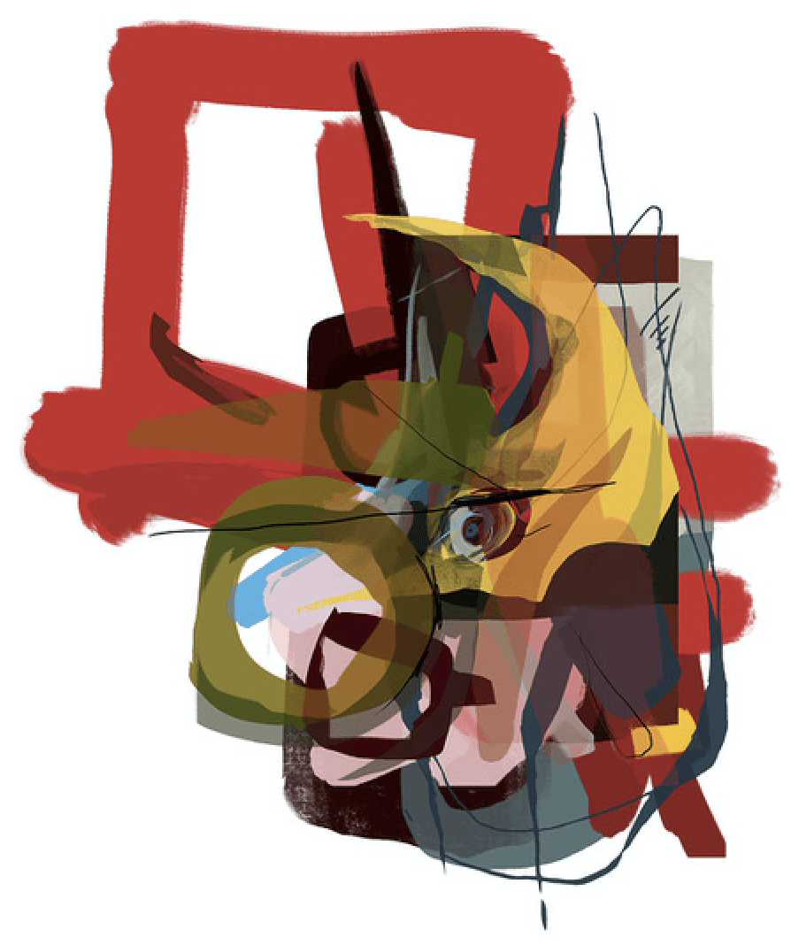
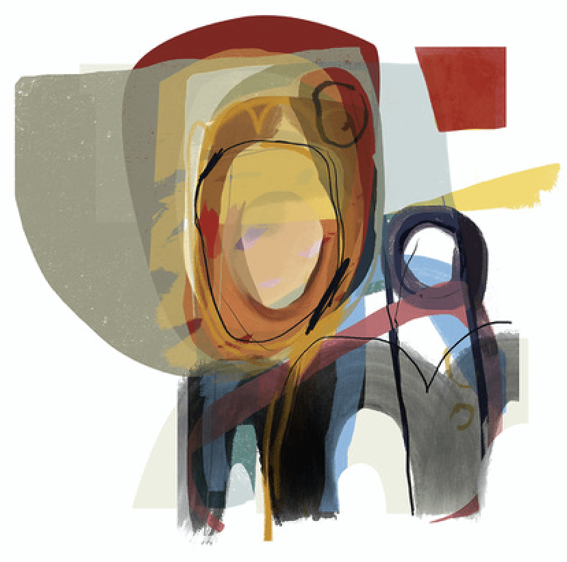
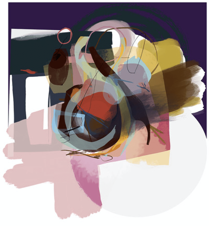
A: Issue 93 of Aesthetica displayed the piece Coping. To what extent is it tied to the Hope series?
PB: The work is a great way of confronting and working through emotional stresses. The past four or five years have been turbulent emotionally with my late partner’s diagnosis, treatment and death due to cancer and I think it was incredibly helpful to cough up and spit out a lot of the tensions and turmoil in a visually accessible way that I can now look back on and assess in hindsight.
Even today as well as coping with life with a brain injury and adjusting to the loss of a loved one, it’s clear for me to see within the work – through the multilayered nature of the images – the complex interaction of thought and emotion at work in my mind.
A: Your way of working offers endless vibrant possibilities. Is this daunting, or does it motivate you?
PB: It’s great! I’m like a kid in a sweet shop and, as I’ve mentioned before, working digitally allows for so much more freedom in editing and fine-tuning work as it progresses.
I’m constantly trying out different brushes or painting media and just seeing what happens. If it’s something I like then fine but if not then I can take a step back in the process and have another go.
www.riseart.com/artist/paul-brown
www.instagram.com/paulbrownart
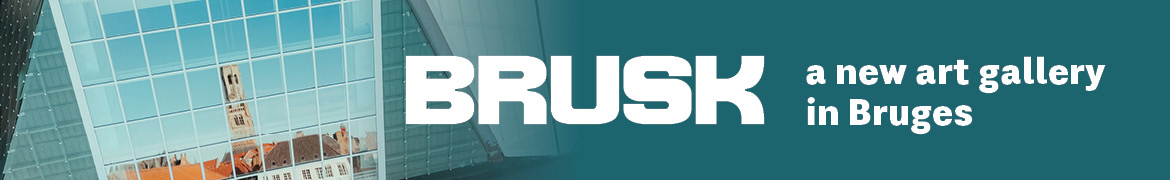
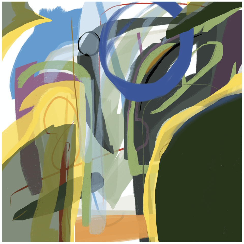
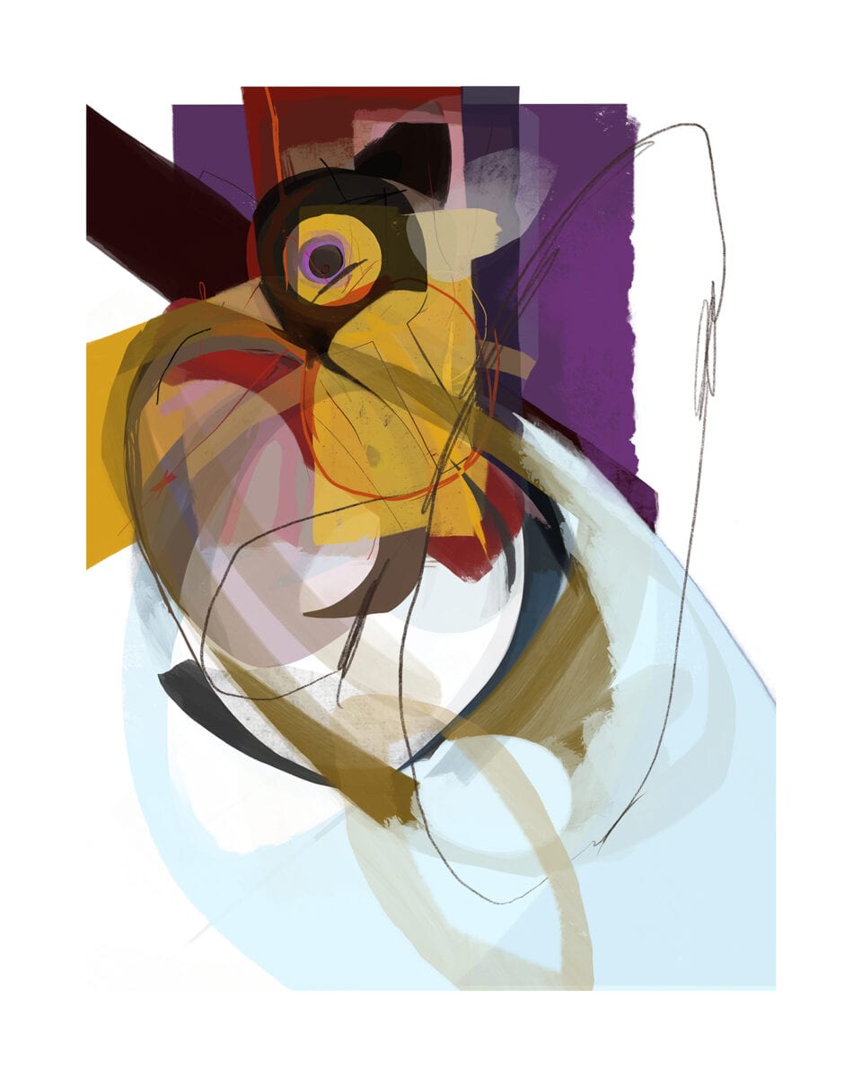
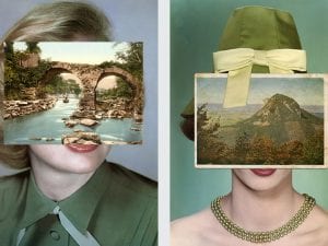
Lead image: Fallen.
The work of Paul Brown appears in the Artists’ Directory in Issue 93 of Aesthetica. Click here to visit our online shop.
