
What is the origin of colour? In honour of the Year of Van Eyck in Ghent, Design Museum arranged a large exhibition on the innovative and diverse use of colour. The exhibition starts from the unprecedented hues of Jan van Eyck and illustrates the significance of colour to contemporary designers. Siegrid Demyttenaere, Curator, discusses highlights from the show and the future of design.
A: Why did you decide to Jan Van Eyck as the inspiration for this show? What about his contributions to early renaissance art stands out to you the most?
SD: The exhibition started off by a request of Katrien Laporte, the Director of the Design Museum Gent, if I wanted to create an exhibition on colours in contemporary design, related to the colours use of the medieval painters: the brothers van Eyck. I am not a historian, so I was, at the same time, very triggered, but also very unsure.
First of all, I started to read as much as possible on Van Eyck and early Renaissance art. I discovered a whole world of knowledge and research. I must say it almost became like a sort of an addiction. The more you read the more you want to know about this master painter and his contemporaries. The books you can find on Van Eyck are absolutely marvellous.
After getting acquainted I started looking for a way to link it with the work contemporary designers. First, I thought this was an impossible mission – no one can match the skills of Van Eyck. So, I started to work from the different layers you can discover in the work of Van Eyck: the knowledge; the inspiration; and the mystery and symbolism.
Most painters of that time were artisans, but it soon became clear that Van Eyck was more than a craftsman. The sharpness of his brush stroke and the brightness of his colours were unparalleled. The modernity of Van Eyck lies in the mastery of the Arab optics of Alhazen (the first true scientist in the world from the 11th century). In this philosophy, the light reflected from objects provides all the information about the texture of the object’s surface. Van Eyck had knowledge of optical literature, frequently using gems and jewels, textiles and textures. Van Eyck’s lively colour palette is a direct result of this knowledge – he painted with light. When you look at the work of some contemporary artists and designers you notice some parallel thinking and processes.
A: How did he revolutionise the use of colour through oils and transparent glazes?
SD: Jan Van Eyck painted from scratch using oil paint. The medium consisted of oil, solvent and lacquer measured in specific proportions. In a strict process, he changed medium mixtures with the paint according to the rule; fat over lean. Lean is a mixture of 50% oil paint and 50% solvent. As he built up layers, the mixture changed to a higher grease consistency by adding varnish and oil to the paint. The fat over lean process prevents “tearing and breaking” if the painting dries over time.
Van Eyck exploited the transparency of the paint. He used several thin layers of paint, which he applied from light to dark, which made the colour even more intense. This effect was further enhanced by the white lime layer applied between the panel and the paint for insulation. The reflection of the colours on the white underlay creates a deep shine. However, this analysis of Van Eyck’s method of working does not fully explain the particularity of Jan van Eyck’s artworks. The great detail and special appearance of the paintings could never be achieved without the great craftsmanship of the artist.


A: How did you decide to curate the show – what journey does it take viewers on through rooms?
SD:This three-part exhibition features Research Projects, a Pigment Walk, and The Experience Rooms. The Research Projectsincludes a presentation of different in-depth research projects answering simple questions: Where does colour come from? How can colour be made? What can be done with colour? What is the impact of colour? Many designers and artists have been doing research in colour. This is a selection of projects that refer to the restauration, research or use of colours.
The Pigment Walk is conceived as a walk through the universe of pigments which Jan van Eyck and his contemporaries explored, with knowledge, inspiration and mystery serving as the underlayers. Projects by designers in various design disciplines (product design, crafts, textile design, graphic design, jewellery design, architecture etc) have worked on the of research colour, others focussing on its materiality, whilst some are more interested in colour and perception, or the impact of colour in a spatial context.
In The Experience Rooms, you feel the mystical underlay, which arouses all kinds of emotions. We want you to be immersed. The periodic rooms of Hotel De Coninck form a large part of the exhibition; they are transformed into ‘experience rooms’ where contemporary designers (or alchemists) are invited to create a project under the theme: colour and the senses (see, hear, smell, taste, touch, move and balance) in collaboration with an institution, school or the industry. The designers have been asked to create an in-situ installation in one of the historic rooms of the design museum and to think of how one can experience colour using one or several senses.

A: What does colour mean to us today? Why is it important to reduce to its building blocks in terms of design? How does it influence us?
SD:The relation between design and colour is as vital as the relation between colour and light. Actually, an object only exists through its colour, meaning the light that falls on the object creates the colour. In the dark, we can’t see the colour, nor the object. The human eye and brain together translate light into colour. Light receptors within the eye transmit messages to the brain, which produces the familiar sensations of colour.
Colour theory is a science and art unto itself, which some build entire careers on, as colour consultants or sometimes brand consultants. Knowing the effects colour has on a majority of people is an incredibly valuable expertise that designers can master and offer to their clients. There’s a lot to it, something as simple as changing the exact hue or saturation of a colour can evoke a completely different feeling.
A: What is the goal of the exhibition?
SD:The aim of the exhibition is to be an eye-opener – to show to visitors of all ages that design concerns all of us. This awareness can be evoked through large immersive installations, but also through small poetic objects or a long-term research on a certain subject. Design is so much more than just creating a functional object; contemporary designers are concerned with the environment and want to help creating a better world to live in. Designers work hard on finding solutions, often in collaboration with scientists or creators from other disciplines. They shape the world of tomorrow.
A: When will the show be projected to re-open? Are elements of it available online?
SD:Instead of a catalogue, DAMN°magazine will dedicate an entire issue on colour with many interviews and articles on the exhibition. We were supposed to launch it during the Salone del Mobile mid-April, but since the Salone is cancelled, we will launch here in the Design Museum when it reopens. Please check the museum’s website: Due to the closure of the museum we have not yet been able to show you Kleureyck. That’s why we’re video calling the designers from the exhibition to give you a sneak peek.
Credits:
1. Germans Ermičs, Low Horizon Screen, 2017 © Germans Ermičs /picture by Floor Knaapen.
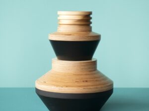
2. Dawn Bendick, Time Rock Stack, 2019 © Dawn Bendick / picture by Kristy Noble.
3. Sabine Marcelis & Brit van Nerven, Seeing Glass – Big Round Mirror (Aubergine), 2019 © Sabine Marcelis & Brit van Nerven.
4. Caroline Cotto, EGGLIPSE “Egg shells as a skin”, 2018 © Caroline Cotto / picture by Biel Garcia Belmonte.

